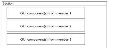
You can use the User Input Group for two main purposes: controlling GUI layout and putting the same activation conditions on several user inputs. The latter is usually a consequence when implementing the first. Grouping of user inputs also makes it possible to define the section name and to create help contents for the section. The GUI layout option under the GUI Options section controls the behavior of a user input group. The available layouts are Group members below each other (the default), Group members placed in a stack, Create a widget for each vector component, Radio buttons from first user input, others interleaved, Group members define columns in table, or Group members define a section.
 |
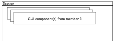
If any of the user inputs or user input groups has the option Hide user input in GUI when inactive selected, it gets hidden when inactive. It is still present, and its presence can be noted because it occupies a small empty space in the layout. If you only have one hidden member like this, you hardly notice it, but if there are several such hidden members in a row, you get a clearly visible empty space. You should then use the option Group members placed in a stack (see below).
 |
The recommended way of creating a section is to use the Section node instead of the User Input Group node.
|
|
•
|
When you have at least one Constraint node in your feature. The constraint usually adds a special section for weak constraints and constraint type selection, so you must specify all other sections as a section group.
|
 |
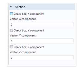
Figure 2-3: A screen shot of a window created with the layout option “Create a widget for each vector component.”
Use this option when you want two or more radio buttons (option buttons) that control the visibility of other user inputs or groups. The first user input must have a set of valid values, each one representing one radio button. The number of group members except the first one has to be equal to the number of allowed values in the first user input. Similar to the previous GUI layout, you get the GUI components of a group member after each radio button. It is also common that you activate the group members depending on the value of the radio-button input. See Figure 2-4 that displays an example with two radio buttons. It needs three user inputs, where the first one has two allowed values.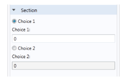
Use this option when you want to combine several user inputs into a table GUI component, where each user input represents a column in the table. This requires that the user inputs are vectors and have the same dimension. In the Table height field you set the height of the table in pixels. You can control the behavior of the table through a couple of check boxes listed in the table below:
The table columns get their headers from each user input if the Table headers list has the option Use user input descriptions. Choose Specify to enter them manually in the table that pops up below the list. The last table controls the settings for each column, where you specify the column settings in the corresponding row. The table below summarizes the available options.
 |